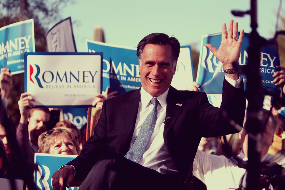
As digital director at the DNC during the 2012 cycle, my team was focused on putting chinks in Mitt Romney’s armor. Luckily for us, he offered many opportunities. One of the biggest complaints about the Romney-Ryan platform was that they kept talking about this tax plan that just didn’t add up. But at every turn, they deflected questions without having to account for it.
Our sense was this was a great opportunity not only because of the real financial implications for American families, but also because their slippery avoidance of the issue played into deeper human concerns about the trustworthiness of this oily pair. We didn’t want yet another creepy black and white ad with haunting music or a record scratch. We wanted something stickier.
And the solution was to emulate the Romney campaign. Not only to match the look and feel of their site, but through a simple visual interaction, to match their behavior. And it just worked.
Give it a whirl.
Slate called it The Cleverest Presidential Campaign Ad You’ll See Online. It went to #1 on Reddit’s homepage. More than a million people liked and shared it on Facebook practically overnight.
But what I love most is that while it was built by digital experts who were leveraging the most sophisticated, cutting-edge technology available on other fronts, it wasn’t the technology that made this work. (As one of our team members pointed out, this was literally an old Windows 97 gag.)
What made it work was an idea. A very simple one, well-executed.
This project was a true team effort from the talented 2012 DNC digital crew, namely Christina Oliver, Ali Rozell, Drew Tipson, Lizzy Chan, and Karen Heileson.